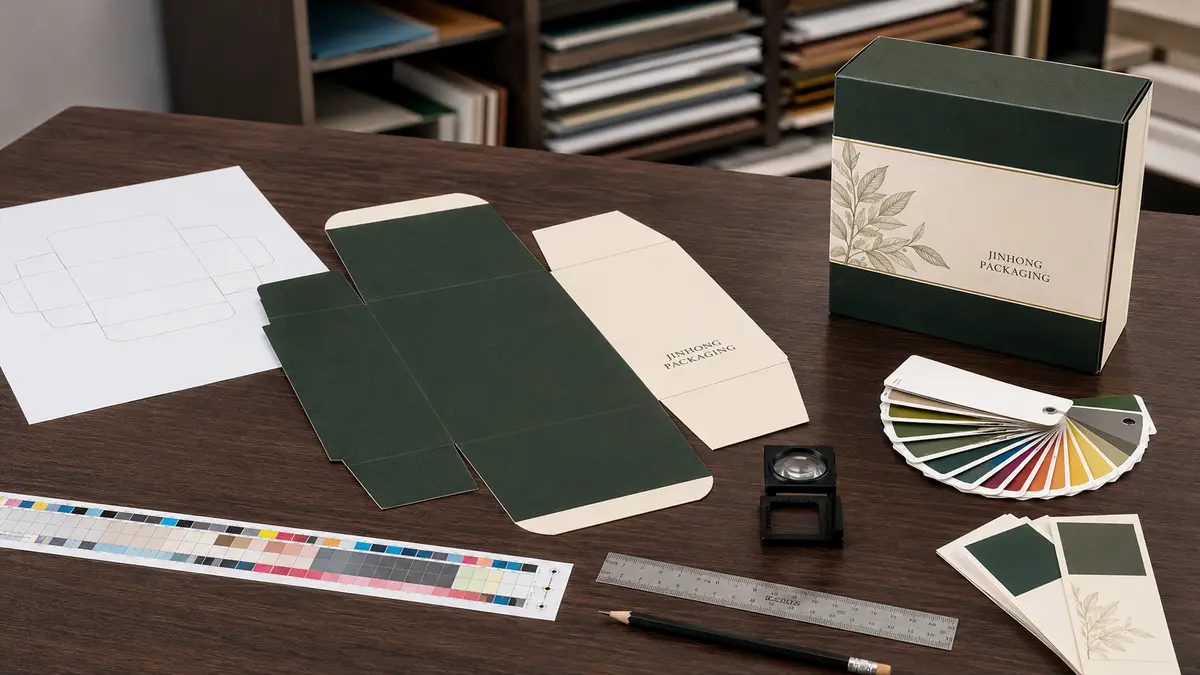
Packaging box printing turns a structural dieline into customer-facing packaging. The final result depends not only on the printing equipment but also on artwork preparation, material selection, color references, finishing layers, proofing, and production tolerances.
A design that looks correct on a computer screen may change when printed on coated paper, kraft paper, colored stock, corrugated board, or specialty paper. Fine text can become difficult to read, dark colors can show rubbing, barcodes may lose contrast, and finishes may shift slightly from the printed artwork.
Preparing these details before production helps reduce revisions, unexpected costs, and differences between the approved design and the finished boxes.
This guide explains the practical steps involved in packaging box printing, from confirming the box structure and preparing the artwork to reviewing color proofs and approving production samples.
Start with the Box Structure and Dieline
The dieline is the technical template used to position artwork on a box. It shows the flat layout before the material is cut, creased, folded, glued, and assembled.
A typical dieline may include:
• Cut lines
• Crease or fold lines
• Glue flaps
• Bleed areas
• Safe areas
• Perforations
• Window openings
• Locking tabs
• Tear strips
• Finishing positions
• Inside and outside print areas
The artwork should be created on the final approved dieline rather than on an approximate rectangle. Even small structural changes can alter panel dimensions, folds, glue areas, and the position of important graphics.
Confirm the Internal Box Size First
The required internal dimensions depend on the product size, orientation, insert, protective space, and packing method. Once the structure and internal dimensions are confirmed, the dieline can be developed around the chosen material thickness.
Changing the box dimensions after the artwork is complete may require the entire design to be repositioned.
If you are still determining the correct dimensions, read our packaging box size guide.
Identify Every Panel
Before placing artwork, identify:
• Front panel
• Back panel
• Left and right side panels
• Top and bottom panels
• Lid and base areas
• Interior panels
• Glue flaps
• Areas hidden after assembly
A flat dieline can be difficult to visualize. Panel labels and a simple three-dimensional mockup can help prevent upside-down text, reversed side panels, and misplaced opening instructions.
Keep Artwork Away from Glue Areas
Ink, lamination, varnish, and other coatings can affect adhesive bonding. Glue flaps may need to remain unprinted or free from particular finishes.
The required glue-free area depends on the box structure, paper, coating, and adhesive. It should be marked before final artwork approval.
Choose a Printing Method for the Actual Project
The printing method should be selected according to the material, design, quantity, box structure, color requirements, and budget.
This article focuses on artwork and production preparation. For a detailed comparison of individual printing technologies, see our guide to custom packaging printing methods.
Offset Printing
Offset lithography is widely used for printed paperboard and paper-wrapped rigid boxes. It can reproduce photographs, gradients, detailed graphics, CMYK artwork, and spot colors.
The artwork is usually printed on a paper sheet that is later cut, creased, laminated, or wrapped over rigid board.
Offset printing involves plate and setup costs, so it is often more economical for larger quantities. The most suitable quantity depends on the box, sheet layout, materials, finishes, and production arrangement.
Digital Printing
Digital printing transfers the design without conventional printing plates. It can support prototypes, short runs, multiple artwork versions, and projects with changing information.
However, available paper sizes, colors, coatings, finishing compatibility, and color consistency depend on the specific digital equipment.
A digitally printed sample may not match an offset-printed production run exactly. If the final production method will be different, the sample should be treated as a visual reference rather than a perfect color standard.
Flexographic Printing
Flexographic printing is commonly used for corrugated boxes, kraft mailers, labels, and some flexible packaging applications. It works well for repeated graphics and larger production quantities.
Fine gradients, small reversed text, and detailed photographic artwork may require additional review depending on the substrate, ink, plate, and equipment.
Screen Printing
Screen printing can apply opaque ink to colored, textured, or specialty surfaces. It may be used for simple logos, bold graphics, rigid box wraps, reusable boxes, and specialty packaging components.
It is usually selected for specific visual or material requirements rather than detailed full-color images.
The correct printing method should be confirmed before artwork is finalized because every process has different requirements for color, detail, trapping, line width, and image preparation.
Prepare Packaging Artwork in the Correct Format
Print-ready packaging artwork should normally be supplied as an editable vector file or a properly prepared print PDF.
Common working formats include:
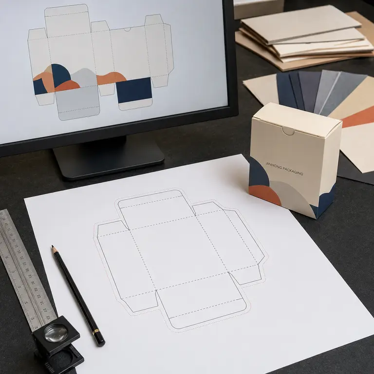
• Adobe Illustrator files
• Print-ready PDF files
• EPS files when required
Other formats may be accepted depending on the production workflow, but compatibility should be confirmed before submitting the final artwork.
Use Vector Graphics Where Possible
Logos, text, icons, barcodes, cutting guides, foil areas, and Spot UV elements should generally be created as vector graphics.
Vector elements can be scaled without losing edge quality and are easier to separate for printing plates, dies, or finishing processes.
Raster images such as photographs can remain pixel-based, but they should be linked or embedded correctly and have sufficient resolution at their final printed size.
Check Image Resolution at Final Size
For continuous-tone photographs, approximately 300 pixels per inch at the final printed dimensions is a common target. Enlarging a small image inside the artwork reduces its effective resolution.
Resolution requirements may differ for line art, one-bit images, large-format graphics, or specific printing methods. Image quality should therefore be evaluated according to its actual use rather than relying only on the original file dimensions.
Images downloaded from websites or social media are often too small or compressed for packaging print.
Outline or Supply Fonts
Missing fonts can change text appearance, line breaks, and spacing when the artwork is opened on another computer.
Before submitting the final file:
• Convert approved text to outlines, or
• Include the licensed font files when the workflow allows it
Keep an editable version with live text for future revisions. Once text is converted to outlines, spelling and product information can no longer be edited easily.
Embed or Package Linked Images
Linked images may disappear if only the main design file is supplied. Embed the images or use the design software’s packaging function to collect the artwork, links, and fonts.
Check that the latest approved image versions are included and that no low-resolution placeholders remain.
Remove Unused Elements
Delete hidden artwork, unused color swatches, duplicate dielines, old design versions, and objects outside the production area unless they are intentionally included as references.
A clean file reduces confusion about which layers and elements should be produced.
Add Bleed and Maintain Safe Areas
Bleed extends printed color or images beyond the final cut line. It helps prevent unwanted white edges when normal cutting variation occurs.
The required bleed depends on the production specification. A common value for paperboard packaging is approximately 3 mm, but the correct amount should always be confirmed for the project.
Extend Backgrounds into the Bleed
Any image, color, or pattern intended to reach the edge of a panel should extend beyond the cut line into the bleed area.
Do not simply enlarge the entire design if that changes the intended position of text or logos.
Keep Important Content Inside the Safe Area
Logos, product names, regulatory text, barcodes, and other important information should remain a suitable distance inside cut lines, folds, windows, and perforations.
The safe distance depends on the structure and production tolerance. Small text placed directly beside a crease may become distorted or move onto the neighboring panel after folding.
Review Corners and Connected Panels
Graphics that continue around corners require careful alignment. Small shifts in printing, cutting, creasing, and folding can interrupt lines or patterns.
Avoid placing elements that require perfect alignment across several folds unless realistic tolerances have been considered.
Set Up CMYK and Spot Colors Correctly
Most full-color packaging artwork is prepared using CMYK:
• Cyan
• Magenta
• Yellow
• Black
These inks combine to reproduce photographs, illustrations, gradients, and a broad range of colors.
However, CMYK cannot reproduce every color visible on an RGB screen. Bright neon shades, some blues, greens, oranges, and highly saturated colors may appear less intense in print.
Convert RGB Artwork Carefully
Images and designs created for screens often use RGB color. Converting them to CMYK can change saturation, brightness, and contrast.
Do not rely on a simple automatic conversion without reviewing the result. The correct color profile and separation approach depend on the printing process, paper, ink, and production requirements.
Use Spot Colors for Important Brand Colors
A spot color uses a separately mixed ink rather than building the color from CMYK process inks. Pantone Matching System references are commonly used to communicate spot-color targets.
Spot colors may be useful for:
• Important brand colors
• Large solid color areas
• Colors difficult to reproduce in CMYK
• Designs using only one or two colors
• Consistency across selected printed components
A Pantone reference helps communicate the intended color, but it does not guarantee identical results across every paper, coating, printing process, and production batch.
Distinguish Coated and Uncoated References
The same color reference can appear different on coated and uncoated paper because the surfaces absorb and reflect ink differently.
Confirm whether the selected reference is intended for coated or uncoated material and evaluate it on a paper similar to the final stock.
Set Rich Black and Small Black Text Separately
Large black areas may use a controlled combination of CMYK inks to create a deeper appearance. Small black text is usually safer as 100% black only to reduce registration problems.
Do not apply an arbitrary rich-black formula without confirming the production requirements. Excessive total ink coverage can cause drying, rubbing, set-off, and other print issues.
Manage White Ink on Colored or Transparent Materials
White ink may be needed when printing on dark paper, kraft board, metallic stock, transparent film, or other non-white substrates.
White ink can serve as:
• An opaque printed color
• A base layer under other colors
• A selective element that allows the substrate to remain visible elsewhere
White ink areas should be placed on a clearly named separate artwork layer. Opacity and final color appearance should be evaluated with a physical sample because the substrate will influence the result.
Allow for Trapping, Overprint and Registration
Printing, cutting, and finishing processes have normal production tolerances. Small shifts can create visible gaps between adjacent colors or move a finish slightly away from the printed artwork.
Artwork preparation should account for these tolerances.
Trapping
Trapping slightly overlaps adjoining colors to reduce the risk of an unprinted gap when registration shifts.
The appropriate trapping settings depend on:
• Printing method
• Ink sequence
• Paper
• Color combination
• Line width
• Production workflow
Trapping is often handled during prepress, but designers should avoid artwork that depends on impossible edge-to-edge precision.
Overprint
Overprint allows one ink or object to print over another rather than knocking out the area underneath.
Incorrect overprint settings can make text disappear, change colors, or produce unexpected results. White artwork set to overprint may not print at all because white usually represents the absence of ink.
Before approval, review:
• Black text and line overprint settings
• White objects
• Spot-color layers
• Barcodes
• Finishing separations
• Knockout areas
An overprint preview can help identify potential problems, but the final settings should still be reviewed during prepress.
Registration Tolerance
Perfect alignment cannot be assumed between:
• Different ink colors
• Printed artwork and cutting
• Printing and foil stamping
• Printing and Spot UV
• Foil and embossing
• Windows and printed borders
Designs should include reasonable allowances. Thin borders placed directly beside cut lines and fine outlines that must align exactly with foil or UV are particularly sensitive.
Prepare Text and Required Product Information
Packaging must communicate information clearly. Depending on the product and market, the box may need product identification, instructions, warnings, ingredients, contact information, batch details, recycling information, or other required content.
Jinhong Packaging does not determine the legal labeling requirements for a brand’s product or destination market. Final text and regulatory content should be confirmed by the brand or an appropriate compliance specialist before production.
Use Readable Text
Legibility depends on more than font size. Consider:
• Typeface
• Stroke thickness
• Contrast
• Ink color
• Background pattern
• Paper texture
• Coating or lamination
• Reversed or positive text
• Printing method
Very thin fonts and small reversed text can fill in, break, or become difficult to read. A physical proof or sample is more reliable than checking only a magnified screen image.
Check Every Text Element
Before approving artwork, verify:
• Product name
• Variant
• Net quantity
• Ingredients or material information
• Instructions
• Warnings
• Company and contact information
• Website and QR destination
• Country or market-specific text
• Batch or date coding area
• Spelling, punctuation, and capitalization
• Languages
• Legal and trademark symbols
Text errors discovered after plates, dies, or production materials are prepared can cause delays and additional cost.
Plan Variable Information Areas
Batch numbers, production dates, expiration dates, serial numbers, and other variable information may be added during filling or packing.
Confirm:
• The required blank area
• Coding method
• Ink or label adhesion
• Contrast
• Orientation
• Accessibility after box assembly
Lamination and coating can affect the ability of some coding inks or labels to adhere to the surface.
Prepare Barcodes and QR Codes Carefully
Barcodes and QR codes should be treated as functional elements rather than decorative graphics.
Barcode Considerations
A barcode needs sufficient contrast, appropriate size, clear quiet zones, and suitable placement. It should not be distorted, stretched, cropped, or placed across a fold or curved edge.
Avoid placing barcodes on:
• Fold lines
• Box corners
• Glue flaps
• Heavily textured paper
• Metallic foil
• Reflective surfaces that interfere with scanning
• Areas with insufficient contrast
Barcode standards and verification requirements depend on the code type, product, retailer, and market. The responsible brand should supply the correct barcode data and confirm the applicable specification.
QR Code Considerations
QR codes should be tested using the final intended size, color contrast, printed material, and destination link.
Keep enough clear space around the code and avoid placing it over:
• Complex photographs
• Strong paper texture
• Foil
• Embossing
• Debossing
• Spot UV patterns
• Folds and cut lines
Always test the actual printed code with multiple devices. A code that scans from a computer screen may not scan reliably after printing, coating, or reducing its size.
Coordinate Printing with Packaging Box Finishes
Printing and finishing should be planned together. Lamination, foil, Spot UV, embossing, debossing, and other processes can change color appearance, surface texture, and registration.
For a detailed comparison, read our guide to packaging box finishes.
Lamination and Coatings
Matte lamination can soften color appearance, while gloss lamination may increase visual saturation and reflection. Soft-touch and anti-scuff films also have different tactile and handling characteristics.
Coatings and films may affect:
• Color
• Gloss
• Fingerprint visibility
• Scratch resistance
• Glue adhesion
• Folding performance
• Coding and label adhesion
The final surface treatment should be included when evaluating color.
Foil Stamping
Foil areas should be supplied as separate vector artwork. Very fine lines, small text, rough paper, and large solid foil areas may require adjustment or sampling.
Do not simulate metallic foil using a gold-colored CMYK gradient if a true reflective metallic effect is required. Printed gold and metallic foil are different processes with different appearances.
Spot UV
Spot UV artwork should be separated from the printed design. Fine registration between a printed element and Spot UV requires realistic tolerance.
Spot UV is often more visible over a matte background because the contrast in sheen becomes easier to see.
Embossing and Debossing
Embossing raises the selected area; debossing presses it inward. Both require suitable artwork, tooling, paper, and positioning.
Keep important relief details away from folds, cuts, windows, glue areas, and structural components unless the design has been reviewed for production.
Review the Artwork Before Prepress
A structured artwork review helps identify problems before plates, dies, or samples are produced.
Check the following:
• Correct dieline version
• Final box dimensions
• Correct panel orientation
• Bleed extension
• Safe margins
• Fold and cut clearances
• Glue-free areas
• CMYK and spot-color setup
• White ink layers
• Foil, UV, embossing, and debossing layers
• Image resolution at final size
• Fonts and linked images
• Spelling and product information
• Barcode and QR code placement
• Interior and exterior printing
• Hidden or unused elements
• Final file name and version
Approval responsibilities should also be clear. The brand should confirm artwork content, product information, barcodes, regulatory text, and design accuracy, while the packaging project team can review structural fit and production preparation.
Understand Different Types of Packaging Proofs
A proof helps evaluate selected aspects of the packaging before full production. Not every proof uses the final material, printing process, finish, or tooling.
Digital PDF Proof
A digital proof shows artwork placement, panel orientation, text, and basic layout.
It is useful for checking:
• Content
• Spelling
• Position
• Dieline alignment
• Finishing layers
It should not be used as a reliable physical color or material reference because monitor calibration and screen display vary.
Printed Color Proof
A printed proof can provide a more useful reference for images and general color appearance. However, it may be produced on different equipment or paper from the final packaging.
Confirm whether the proof is:
• A contract color reference
• A digital simulation
• Printed on production material
• Produced with the intended inks and coating
Structural White Sample
A white or unprinted sample is used to check dimensions, assembly, product fit, opening, insert design, and structure.
It does not confirm final printing or finishing.
Digitally Printed Sample
A digitally printed sample can show the overall design on a physical box. It may be useful for photography, presentation, fit review, and general appearance.
If mass production will use offset printing, flexography, or another process, color and surface details may differ.
Production-Standard Sample
A closer production-standard sample may use final or similar materials, printing, tooling, and finishing processes. It normally requires more time and cost than a basic prototype.
Before approving any sample, identify exactly what it is intended to confirm.
Evaluate Color with Physical References
Color on a screen is affected by monitor settings, brightness, software, and lighting. A photograph sent by email or messaging is also not a reliable color standard.
Useful physical references may include:
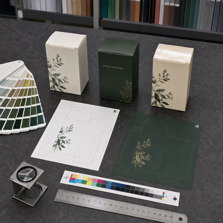
• Pantone color references
• Approved printed samples
• Paper swatches
• Ink drawdowns
• Color proofs
• Material samples
Record the Approved Reference
A written approval should identify:
• Color reference
• Paper or substrate
• Coating or lamination
• Proof or sample version
• Date
• Approved artwork file
• Acceptable tolerance when applicable
Retaining an approved physical sample can help with production review and future repeat orders.
Understand Repeat-Order Variation
Printing conditions, paper batches, ink, coatings, equipment, and environmental factors can create differences between production runs.
A spot-color reference and retained sample can support color control, but no responsible process should promise that every batch will be visually identical under all conditions.
Repeat orders should refer to the previously approved specification and sample, while allowing for agreed production tolerances.
Approve a Packaging Sample Before Production
A sample approval should consider more than color.
Review the assembled box for:
• Correct dimensions
• Product fit
• Panel alignment
• Opening and closing
• Glue strength
• Print position
• Color appearance
• Text legibility
• Barcode and QR scanning
• Fold and crease quality
• Lamination or coating
• Foil and Spot UV registration
• Embossing or debossing depth
• Surface rubbing and scratches
• Interior printing
• Insert placement
• Packing and shipping protection
Photographs can help document issues, but they should be supported by measurements and clear written comments.
Avoid vague feedback such as “make it more premium” or “the color feels wrong.” State the panel, element, expected change, and physical reference whenever possible.
Check Production Specifications Before Approval
The final production specification should include:
• Box style
• Internal and external dimensions
• Board and paper specification
• Printing method
• Ink colors
• Interior and exterior print coverage
• Lamination or coating
• Foil specification
• Embossing or debossing
• Spot UV
• Window and insert
• Accessories
• Quantity
• Packing method
• Outer-carton requirements
• Approved artwork version
• Approved sample or color reference
• Agreed inspection requirements
A clear specification reduces the risk of assumptions and makes repeat-order coordination easier.
Packaging Box Printing for Different Materials
Folding Cartons
Folding cartons are usually printed on paperboard before cutting, creasing, folding, and gluing. Artwork must account for creases, glue flaps, locking tabs, and the direction in which panels are assembled.
Learn more about folding carton boxes.
Rigid Boxes
Rigid boxes are commonly wrapped with printed or colored paper. The wrapping paper extends around edges and corners, so the artwork needs appropriate allowances and alignment.
Sharp patterns and borders that cross wrapped corners can be difficult to align perfectly.
Corrugated and Mailer Boxes
Corrugated boxes may be printed directly or use a printed liner laminated to the corrugated board. Surface texture, flute profile, ink absorption, and print method affect detail and color.
Designs should reflect the actual print process rather than assuming the same result as smooth coated paper.
Kraft and Colored Paper
Kraft and colored paper influence printed ink because the substrate is not white. Colors may appear darker, warmer, or less saturated.
White ink may be used as an underbase or a separate design color when greater opacity is required.
Common Packaging Box Printing Mistakes
Starting Artwork Before the Dieline Is Final
Structural changes can move every panel and finishing position. Confirm dimensions and structure before completing the design.
Using RGB Images Without Print Review
Bright RGB colors may not reproduce in CMYK. Convert and review images according to the intended printing workflow.
Placing Text Too Close to Folds or Cuts
Normal production variation can move text or graphics onto an edge. Maintain appropriate safe margins.
Supplying Low-Resolution Images
Images that look acceptable on a screen may appear soft or pixelated in print. Check effective resolution at the final printed size.
Expecting a Screen to Match Printed Color
Screen colors are emitted light; printed colors depend on ink, material, coating, and reflected light. Use physical references for critical colors.
Ignoring the Final Finish
Lamination, coating, foil, and texture can change color and surface appearance. Evaluate printing and finishing as one system.
Approving Without Checking Text and Codes
A structurally correct sample can still contain spelling errors, outdated information, or an unscannable code. Complete a separate content review.
Making Unsupported Environmental Claims
Terms such as “eco-friendly,” “green,” and “sustainable printing” require clear, supportable explanations.
Claims should identify specific features such as certified paper, recycled content, ink type, or disposal instructions and consider the full packaging construction. Businesses selling into the United States can consult the Federal Trade Commission’s Green Guides.
Frequently Asked Questions About Packaging Box Printing
What file format is best for packaging box printing?
An editable Adobe Illustrator file or properly prepared print PDF is commonly preferred. Logos, text, dielines, barcodes, and finishing areas should generally be vector-based. Confirm the required format before submitting final artwork.
Should packaging artwork use CMYK or RGB?
Most full-color printed packaging uses CMYK or a combination of CMYK and spot colors. RGB artwork should be reviewed and converted according to the intended print conditions because some screen colors cannot be reproduced accurately with printing inks.
What image resolution is required?
For photographs at their final printed size, approximately 300 PPI is a common target. Requirements can differ for line art, large-format graphics, and specific printing methods, so effective resolution should be checked during prepress.
What is bleed in packaging artwork?
Bleed is the printed area extending beyond the cut line. It helps prevent unwanted unprinted edges when normal cutting variation occurs. The required amount should be confirmed for the project; approximately 3 mm is common for many paperboard applications.
Can printed packaging match a Pantone color exactly?
A Pantone reference helps communicate and control a target color, but the result is affected by paper, ink, coating, equipment, lighting, and production tolerance. Review a physical proof or approved sample on material similar to the final packaging.
Is digital printing suitable for packaging samples?
Digital printing can be useful for visual prototypes and short runs. If the final production uses a different process, the digital sample may not be an exact color or finish reference.
Do I need a physical sample before production?
A physical sample is strongly recommended when structure, fit, printing, color, finishes, barcodes, or presentation are important. Confirm what the sample represents because not every sample uses final production materials and processes.
Who checks the packaging text and legal information?
The brand is responsible for confirming product content, spelling, barcodes, warnings, and applicable regulatory information. A packaging partner can review artwork placement and production preparation but should not be assumed to provide legal compliance approval unless that service is specifically arranged.
Can the same artwork be used for repeat orders?
Yes, but the approved file, specification, color reference, material, and finishing details should be recorded. Before reordering, check whether any product information, barcode, regulation, structure, or material availability has changed.
Final Thoughts
Successful packaging box printing begins before ink reaches the paper. A confirmed dieline, clean artwork, correct color setup, suitable images, realistic production tolerances, and a structured proofing process all influence the final result.
The best printing method depends on the box structure, material, design, quantity, finishes, budget, and required level of color control. Physical samples and written specifications help turn a screen-based design into packaging that can be produced consistently.
Jinhong Packaging supports box sourcing, dieline and artwork coordination, material and printing comparison, sample follow-up, production coordination, and shipment preparation through selected manufacturing partners. Each project is reviewed according to its product, design, quantity, destination, and performance requirements.